NATASHA WARR AS MEDIA
PHOTOGRAPH RESEARCH

This magazine cover is ideally how I would like my front cover to look. The colours work really well together, they blend in together, making the whole magazine cover look outstanding; making it draw in peoples attention. There is minimal writing on the magazine cover which is good because it makes the picture stand out more and grab peoples attention which is ultimately the aim of the front cover; which is how I would like my front cover to be. Although, I would like my magazine cover to have slightly more writing than this because this does look slightly more like a poster than a magazine cover.

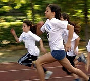
This image is another action shot, but instead of individuals running it is three girls running as a group, however there is only the focus on one individual, the girl at the front. The background is blurred behind the runners, to make it seem like they are running fast. However, the two girls behind the main model have blurred features on them which does not make the picture as good as it could be. On my magazine cover, I would only like to have one model instead of a group of people.
This picture is an action shot, which is how I would like my magazine cover to be, it is a good quality picture with the floor colour matching the athletes top which draws attention. It is focused on the athlete, the athlete jumping is the main attraction in this which is relatable to the image above which is how I would like my front page to be; because it allows people to know the magazine is about sport, and the focus is purely on the athlete.

This image is also an action shot but there is no real focus to the image. This does not really draw the attention of readers because it is just someone swimming, there is no real focus to either the swimmer nor the pool, it is a bland picture. It does show splash behind the head which is his feet kicking but it does not look right. There needs to be more to the picture such as a couple of swimmers behind him or a blurred background to make the individual stand out more.
SPECIFIC IMAGES - FOOTBALL

This picture is something that I want to try and replicate for the front page of my magazine cover. This image is eye catching and makes a statement to the readers. It makes them aware that this is a football magazine and it is a realistic shot of a footballer in action. An action shot for the front cover encourages readers to buy the magazine as it is eye catching to see.